Following up my Franklin Booth post, how about I do a series of comics and art posts this week?
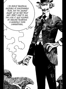
I made a fine recent purchase on Comixology: Sergio Toppi’s The Collector. If you don’t know Toppi, a Google image search will give the flavor. The comic is pretty ok. The Collector is a cool-looking, mysterious dude who collects precious antiquities. He always gets what he wants. He’s like an amoral Indiana Jones. There are supernatural elements. Mostly you read it for the art:
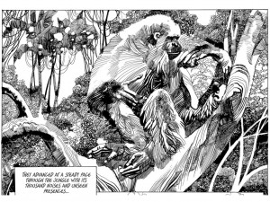
Pace his protagonist (who just shot someone’s escaping fish), Toppi’s linework consists, to an astonishing degree, of theatrical gestures of questionable taste. His angles are downright bizarre, crosshatch-wise. But somehow he has the knack for breaking all the rules while giving the impression that he was following some rule very tastefully. For putting folds into drapery corresponding to no possible drapery fold, while making it read as drapery. Look at this orang, for example:
What a way to draw.
Fine crosshatching – such as Franklin Booth spent so long mastering – can seem to produce a ‘realistic’ effect. Even though, obviously, the world doesn’t look the least bit like it’s criss-cross covered with fine little lines. We could argue about it all day, but perhaps you will grant me this: the strong impression of light and shadow, hence depth and volume, trumps the obtrusive fact that it’s just little lines. It’s neat that you can produce such a powerful illusion while wearing on your sleeve, as it were, the plain mechanism of the trick. You can’t miss the lines, yet you never see the picture just as lines. It’s not like you can do a duck-rabbit thing with Booth, seeing it first as a pretty lady in billowing robes, stringing phone lines, then see it just as lines, no lady. We can see that, in the flat, it’s a wonderful feat of graphic design. But we really can’t see it as that design, in the flat. The design itself is too monotonous. That’s the secret of most graceful ink shading and hatching. Immediate, yet unobtrusive, omnipresent, yet unobstructive. (It sounds like I’m trying to hire a butler.)
Toppi also produces images that read strongly as ‘realistic’, light-and-shade-wise, while equally obviously being nothing of the sort. (It’s not like there’s an illusion of reality. But there’s an illusion of the real presence of realism.) Yet here the expressionistic variety of the hatches and lines induces counter-currents, causing you to read it strongly as flat and ornamental, like a Klimt. You really can flatten it out into pure ornament, then let it spring back into an impression of highly realistic volume and depth, light and shadow. You can duck-rabbit it. Bunch of lines. Realistic image. Bunch of lines. Realistic image.
I think there’s some Toppi in Mike Mignola. He’s sort of a cross between Kirby and Toppi.


{ 4 comments }
Phil 02.24.16 at 9:42 am
He’s clearly self-taught – you don’t unlearn cross-hatching that effectively – and I wonder if he’s drawing on experience with psychedelics; it reminds me of the way shape and contour dissolve into space-filling pattern in psychedelic art, and (more permanently and sadly) in the late work of Louis Wain.
heckblazer 02.24.16 at 12:49 pm
If you’re going to start obsessing over comic artists who use cross-hatching to simulate the look of engravings, you should probably check out Jeremy Bastian and his comic Cursed Pirate Girl. His art is pretty insanely detailed.
John Holbo 02.24.16 at 1:32 pm
That looks good, heckblazer. I didn’t know that one. Thanks.
nnyhav 02.24.16 at 4:03 pm
see also Mahendra’s Singh’s forthcoming American Candide, but he’s more the old-school illustrator … (and you already know about The Hunting of the Snark)
Comments on this entry are closed.