OK, we’ve worked out a hockey playoff format. I’m going to cover the Eastern Conference, and the redoubtable Scott Lemieux of <a href=”http://lefarkins.blogspot.com/”>LGM</a> will provide your guide to the Western. Perhaps we’ll even include some vlogs of ourselves watching the games and offering commentary with a couple of large glasses of red wine! That sounds like good fun. I haven’t got my predictions ready just yet, because I’m not done with the best-of-777 coin-tosses I traditionally use for the first round of the playoffs. I’ll have those ready within the next 24 hours or so.
But when <a href=”http://scores.espn.go.com/nhl/recap?gameId=270408011″>the Islanders scrambled into the playoffs over the weekend</a> by sneaking a few pucks past the Devils’ little-known backup goaltender while everyone else was watching the Masters (how little-known is Scott Clemmensen? Apparently he got an email after the game from his parents, who were relieved to know of his whereabouts and thrilled to learn that he was still on the Devils roster), it occurred to me that I might do well, this year, to apply to the NHL playoffs the nearly-flawless prognosticatin’ method I have used in the past for the annual Grand Championship of American Foot-Ball, namely, <a href=”http://www.michaelberube.com/index.php/weblog/mister_answer_man_super_bowl_edition/”>predicting the outcome of the contest by determining which team is wearing the more masculine jersey</a>.
That’s when I realized something that has probably been obvious to many of you, even though (solicitous of my feelings as you are) you have refrained from telling me all these years: NHL logos suck. Really bad. Almost every one of them sucks, and collectively they suck in many different ways.
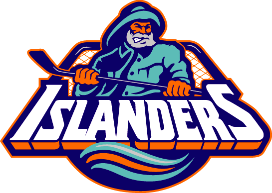
The very worst logo ever inflicted on the sport, certainly, was the Angry Turquoise Fisherman displayed by the Islanders in 1996-97, a figure so embarrassing that (a) the Islanders finished last in what was then the seven-team Atlantic division and (b) they wore the logo for only one year, knowing that it was abysmal even by NHL standards. Indeed, it looks like a minor-hockey-league logo; as one of my hockey-playing friends from the great state of Kansas recently pointed out to me, roughly half of all minor-league hockey logos consist of cartoon characters with hockey sticks. I needn’t add that the perspective on the Angry Turquoise Fisherman is a bit off, so that he appears to be emerging from the net at an angle of about 30 to 45 degrees from the logo itself. Surely this is a minor point in the overall hideousness.
Now, don’t get me wrong. The logos of four of the Original Six — the <a href=”http://www.sportslogos.net/logos/view/124/Montreal_Canadiens/1957/Primary_Logo”>Montreal Canadiens</a>, the <a href=”http://www.sportslogos.net/logos/view/199/Toronto_Maple_Leafs/1983/Primary_Logo”>Toronto Maple Leafs</a>, the <a href=”http://www.sportslogos.net/logos/view/yo3wysbjtagzmwj37tb11u0fh/Detroit_Red_Wings/1949/Primary_Logo”>Detroit Red Wings</a>, and the <a href=”http://www.sportslogos.net/logos/view/venf9fmhgnsawnxxvehf/Boston_Bruins/2008/Primary_Logo”>Boston Bruins</a> — are simple, classic, and cool; their clean lines and crisp graphics are not only virtues in themselves but have long endured, like the insignia of the Yankees and Red Sox, at least since the late Pleistocene period. Why, I even have a bit of fondness for the <a href=”http://www.sportslogos.net/logos/view/56/Chicago_Blackhawks/1965/Primary_Logo”>Chicago Black Hawks’</a> smiling <strike>Indian</strike> <strike>Native American</strike> oppressed indigenous person logo, and I often wonder why it has escaped the kind of criticism visited on the Braves, Indians, Seminoles, Redskins, and Fighting Illini. As for the <a href=”http://www.sportslogos.net/logos/view/144/New_York_Rangers/1979/Primary_Logo”>New York Rangers</a> insignia, eh. It’ll do, but it’s not what you’d call “attractive” or “imaginative.”
Since the first expansion of 1967 through the present, however, good logos have been <a href=”http://scores.espn.go.com/nhl/teams/schedule?team=njd”>as rare as goaltending appearances by Scott Clemmensen</a>. The <a href=”http://www.sportslogos.net/logos/view/161/Philadelphia_Flyers/1968/Primary_Logo”>Philadelphia Flyers</a> and <a href=”http://www.sportslogos.net/logos/view/187/St._Louis_Blues/1999/Primary_Logo”>St. Louis Blues</a> are clearly the best of the bunch, and I consider the Blues’ logo one of the two or three coolest in the league (alongside the Canadiens and Red Wings). The <a href=”http://www.sportslogos.net/logos/view/174/Pittsburgh_Penguins/2003/Primary_Logo”>Pittsburgh Penguins</a> are kinda cute, especially back in their first year when the peppy little penguin <a href=”http://www.sportslogos.net/logos/view/269/Pittsburgh_Penguins/1968/Primary_Logo”>wore a scarf and didn’t scowl</a>. But the <a href=”http://www.sportslogos.net/logos/view/94/Florida_Panthers/2000/Primary_Logo”>Florida Panthers</a>, <a href=”http://www.sportslogos.net/logos/view/129/Nashville_Predators/1999/Primary_Logo”>Nashville Predators</a>, <a href=”http://www.sportslogos.net/logos/view/dmo1xf3z4pph27vmg3gf/San_Jose_Sharks/2008/Primary_Logo”>San Jose Sharks</a>, and <a href=”http://www.sportslogos.net/logos/view/0kcehji928suy4ckk1pdo8s7l/Minnesota_Wild/2001/Primary_Logo”>Minnesota Wild</a> are just Very Scary Animals. Boo! The <a href=”http://www.sportslogos.net/logos/view/32tfs723a3bes0p0hb4hgcy1u/New_Jersey_Devils/2000/Primary_Logo”>New Jersey Devils</a> are pretty good, almost Classic. (And you kind of have to like a team that hails the forces of darkness and aspires to pure unmitigated evil, like the firing of successful coaches at the tail end of the season.) The <a href=”http://www.sportslogos.net/logos/view/50/Calgary_Flames/1995/Primary_Logo”>Calgary Flames</a>, <a href=”http://www.sportslogos.net/logos/view/fotih31tn5r345nufo5xxayh3/Carolina_Hurricanes/2000/Primary_Logo”>Carolina Hurricanes</a>, <a href=”http://www.sportslogos.net/logos/view/scxsuiit824f8druiaf83mo3j/Edmonton_Oilers/1997/Primary_Logo”>Edmonton Oilers</a>, <a href=”http://www.sportslogos.net/logos/view/138/New_York_Islanders/1998/Primary_Logo”>New York Islanders</a>, and <a href=”http://www.sportslogos.net/logos/view/152/Ottawa_Senators/1998/Primary_Logo”>Ottawa Senators</a> are too boring to merit comment. The current logos of the <a href=”http://www.sportslogos.net/logos/view/105/Los_Angeles_Kings/2003/Primary_Logo”>Los Angeles Kings</a> and <a href=”http://www.sportslogos.net/logos/view/215/Washington_Capitals/1996/Alternate_Logo”>Washington Capitals</a> are merely Medium Bad, but at least the Capitals’ Very Scary Eagle and the Kings’ Way Too Ornate Crown are significant improvements over the Kings’ stupid <a href=”http://www.sportslogos.net/logos/view/242/Los_Angeles_Kings/1989/Primary_Logo”>fast-moving word</a> and the Capitals’ <a href=”http://www.sportslogos.net/logos/view/284/Washington_Capitals/1975/Primary_Logo”>not-at-all fast-moving word</a> of yesteryear.
And then there are a few “creative” designs. Although I appreciate the efforts of the <a href=”http://www.sportslogos.net/logos/view/208/Vancouver_Canucks/1998/Primary_Logo”>Vancouver Canucks</a> and the <a href=”http://www.sportslogos.net/logos/view/nlray22u33hhmvm2oyfg/Phoenix_Coyotes/1997/Primary_Logo”>Phoenix Coyotes</a> to devise “northwestern” and “southwestern”-inflected logos (the Coyotes have since decided to go for <a href=”http://www.sportslogos.net/logos/view/8lqmtthh0w2wgumr6goswqmki/Phoenix_Coyotes/2004/Primary_Logo”>realist and plaintive</a> instead, befitting their status as Western Conference doormat), I think both those logos suck too. The <a href=”http://www.sportslogos.net/logos/view/64/Colorado_Avalanche/2000/Primary_Logo”>Colorado Avalanche</a> logo looks like it belongs on a cereal box: <i>new! Low-fat Alpine Müesh</i>! The <a href=”http://www.sportslogos.net/logos/view/17/Atlanta_Thrashers/2000/Primary_Logo”>Atlanta Thrasher</a> is apparently the fierce hockey-stick-wielding state bird of Georgia. The <a href=”http://www.sportslogos.net/logos/view/6elec248g0248fybjjx0/Buffalo_Sabres/2007/Primary_Logo”>dashing new Corporate Bison</a> of the Buffalo Sabres doesn’t have any legs. By contrast with the “creative” designers, the people who designed the logos for the <a href=”http://www.sportslogos.net/logos/view/uulllstj3jvqtwx6ie6kbnzoh/Tampa_Bay_Lightning/2002/Primary_Logo”>Tampa Bay Lightning</a>, <a href=”http://www.sportslogos.net/logos/view/oxahxcheae4mgu4wopqj9ydhy/Dallas_Stars/2000/Primary_Logo”>Dallas Stars</a>, and <a href=”http://www.sportslogos.net/logos/view/fbh4jfr7lwbpuezjx0xbktfmo/Anaheim_Ducks/2007/Primary_Logo”>Anaheim Ducks</a> weren’t even trying, and shouldn’t have gotten paid. And the <a href=”http://www.sportslogos.net/logos/view/42/Columbus_Blue_Jackets/2001/Primary_Logo”>Columbus Blue Jackets</a> are just a mess — a terrible, terrible mess.
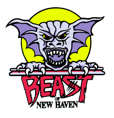
Of the Original Six, only the Red Wings and the Rangers have made the playoffs this year. The wearers of the best two expansion-team logos, the Flyers and Blues, are making their tee times as I type. So picking the winners by logos turns out to be a fairly dismal affair after all. I think I’ll stick with assessing the actual talent on the ice, which is formidable this year; if nothing else, we should be treated to six or seven wonderful series in the first round alone. So I’ll leave you for now with the very bestest logo ever, the logo of the 1997-99 American Hockey League franchise known as “the Beast of New Haven,” a team that played . . . well, I’m not sure <i>where</i> they played, but I do know that my sister-in-law Todd Lyon memorably described the logo as something drawn by a fifteen-year-old boy (not that I have anything against fifteen-year-old boys, now) who “most likely,” as Todd surmised, “has way too many of these festooning the back pages of his Algebra notebook.”
{ 1 trackback }
{ 74 comments }
Gene O'Grady 04.10.07 at 2:30 am
The Red Wings logo reminds me of the winged O symbol of the Olympic Club in San Francisco. Anyone know if there is any relationship, and, if so, which came first? They both look very 20’s (that’s 1920’s for you pups), but that may only prove the limits of my sense of style.
And I kind of like your nominee for worst logo of all time — but then I’ve always wanted a hockey stick in with my fish sticks.
Jackmormon 04.10.07 at 2:48 am
I’m not sure I accept your premises, Bérubé; the Angry Turquoise Fisherman looks as though he’d stop at least two of three.
Kieran Healy 04.10.07 at 2:52 am
The Calgary Flames? Really?
ozma 04.10.07 at 2:55 am
These are hilarious. Milwaukee and Syracuse are especially bad–but good bad.
Oh, the t-shirt options. So hard to decide, so hard to decide.
Michael Bérubé 04.10.07 at 3:00 am
The Calgary Flames? Really?
Oh, the colors are nice enough, and I love me that Jerome Iginla. But the logo is just an inferior variation of the old Atlanta Flames insignia, you see.
Ben Alpers 04.10.07 at 3:01 am
Not much to disagree with here, only to add that the original NHL teams have not only cool logos, but also great uniforms. Those all-red Detroit unis may be the best uniforms in all North American team sports (and I say this with no rooting interest in the Wings…I’m a Devils fan).
All the more reason to wonder at the awfulness of the expansion-team logos. The Minnesota Wild may also have the worst name in all team sports.
Kieran Healy 04.10.07 at 3:07 am
Should’ve called them the Minnesota Fats.
todd. 04.10.07 at 3:15 am
Am I the only one for whom sportslogos.net is not resolving?
todd. 04.10.07 at 3:19 am
Now it’s resolving, but all of the links are “forbidden.” You broke teh interwebz again, Bérubé. And you wonder why we can’t have nice things.
will u. 04.10.07 at 3:27 am
todd: You have to copy and paste the URLs.
I rather like the Ottawa logo. A centurion! Neato.
Sean Carroll 04.10.07 at 3:34 am
I have to confess to deep feelings of inner conflict about the old Mighty Ducks logo. A franchise name that was so bad it took me years to accept that it wasn’t a joke; but the logo says “Hey, I’m stuck with this awful name, but I’m going to work it for all it’s worth.”
The new one, post-inevitable-name-change, just sucks.
P O'Neill 04.10.07 at 3:36 am
Did the ones for the relocated teams suck less in their old locales (off the top of my head, I’m thinking of the Nordiques and the North Stars)?
Kieran Healy 04.10.07 at 3:38 am
Sportslogo don’t want you linking directly to the images without you seeing any other page on their site (or any of their ads, I imagine).
Jeff Fecke 04.10.07 at 4:22 am
P. O’Neill asks:
Did the ones for the relocated teams suck less in their old locales (off the top of my head, I’m thinking of the Nordiques and the North Stars)?
The answer is mas oui and yes, respectively. I’m not quite sure what the old Nordiques de Quebec logo was supposed to make me feel, but its very incomprehensibility says Quebec to me.
As for the old North Stars logo, it was classic–up there with the best in league history. Of course, Norm “Sucks” Green changed the logo to the crappy Dallas Stars incarnation two years before he moved the team, because he was planning to move the team to get away from the bad press from his sexual harassment lawsuit.
As for the Wild–well, hate the name, love the team, I guess. The NBA charted the stupid course where singular nouns could be a team name, and unfortunately, the NHL followed. It’s still better than “Blue Jackets.”
Ben Alpers 04.10.07 at 4:31 am
If memory serves, the Nordiques had a hockey-playing, igloo-like lower-case “n” (i.e. not good).
The Northstars had an “N” pointing to a star, I think. Also not very inspired.
Ben Alpers 04.10.07 at 4:43 am
The hockey-playing fisherman apparently moved north and tried to set up shop with the Halifax Ice Breakers of the proposed, but never operational, World Hockey Association of 2005.
sidereal 04.10.07 at 4:53 am
The Northstars logo was terrible. But I still prefer them to the Dallas Stars, because playing ice hockey in Dallas is a crime against nature.
My current faves are the regal looking Sens and Caps logos. Of course, no sooner do I point that out than the Caps announce they’re changing it to a lame affair featuring some crossed hockey sticks and the Capitol dome, presumably because it looks like a big breast.
sidereal 04.10.07 at 4:56 am
I should also note that the local outfit — that training ground for 17-year-old goons, The Seattle Thunderbirds — have an outstanding logo.
mijnheer 04.10.07 at 5:42 am
The Ottawa Senators arguably have the most ridiculous logo. The name Senators refers to the fact that the Canadian Senate is located in Ottawa. But the unelected Senate is widely ridiculed as a useless chamber filled with ancient party hacks — not exactly the sort of thing to rally hockey fans. Well, let’s see… ancient Rome had a Senate too and the Roman Empire had those cool legionaries, so let’s have a logo that says the team is really the Ottawa Unleash Hell Legionaries and hope that no one notices the difference.
Scott Lemieux 04.10.07 at 6:12 am
The Calgary Flames? Really?
The really funny part is that we kept the name after the team moved from…Atlanta. I really can’t begin to explain the extent to which Sherman’s march through Western Canada is seared into the memory of every Calgarian…
Not quite as bad as the Utah Jazz, I guess.
tom hurka 04.10.07 at 6:14 am
The Senators are so called because that was the name of the Ottawa team back in the 1920s — and they were pretty good. The current red-black-white colours were also that of the old team, so there’s a homage to the city’s hockey past. And back in the 20s the Senate wasn’t as pathetic as it is now.
Teams that move cities and keep a nickname that was only appropriate to their old home are funny. The Utah Jazz and LA Lakers are the most obvious examples. Calgary kept the Flames name from Atlanta, but after the Olympic Torch on top of the Husky Tower became the symbol of the 1988 Winter Olympics, the transplanted name wasn’t so unsuitable.
And many people, certainly Don Cherry, think the Black Hawks’ logo is the best in hockey. It’s certainly the most meticulously drawn. And if it hasn’t attracted hostility from native groups, it may be because the name isn’t derogatory but is that of a respected chief.
rm 04.10.07 at 11:26 am
The Browns Rule should apply to all professional sports . . . I hereby decree! (by the power invested in anonymous blog commentors). (Browns’s rule?) The business can move, but the city/state owns the name.
Except when the name is stupid, or racist and totally unrelated to location (no one needs the Boston Braves again — Red Sox are much better, though it would be interesting to see the logo for the Atlanta Crackers).
North Stars is the perfect name for a Minnesota hockey team, so much so that it was evidently impossible to think of another name.
Cardinals in any sport naturally belong in St. Louis.
It’s not too late to insist that Dodgers can only play in Brooklyn. Right is right/ a fact’s a fact/ it belongs to them/ let’s give it back.
Ken Houghton 04.10.07 at 11:38 am
It would have been more fun if they had renamed themselves, appropriately, to the Calgary Stampede, but I believe that one is still taken.
And, yes, Michael that Rangers logo is classy, but what about the actual jerseys they’re wearing? I note for the record that the advert on their website features Jagr from the rear, presumably to avoid displaying the current jersey.
Then again, it appears they stopped wearing the “Statue of Liberty as cigarette pack” around Feb 1.
rm 04.10.07 at 11:42 am
Observations.
— The current/classic Islanders logo, and the Minnesota Whatever logo look like summer camps. Which is appropriate for Minnesota, and I guess upstate NY.
— The Senators, Maple Leafs, and Bruins look like fraternal organizations. Why hasn’t there been a hockey team named the Elks? The Colorado Elks would have been great.
rm 04.10.07 at 11:50 am
And — yikes — take a look at the 1950s Red Sox logo.
Michael Bérubé 04.10.07 at 12:00 pm
the original NHL teams have not only cool logos, but also great uniforms. Those all-red Detroit unis may be the best uniforms in all North American team sports (and I say this with no rooting interest in the Wings…I’m a Devils fan).
I’ve always loved the Canadiens’ red (home) jerseys — with the midriff stripe. Very old school. We’re talking Newsy Lalonde. Old-time hockey!
All the more reason to wonder at the awfulness of the expansion-team logos. The Minnesota Wild may also have the worst name in all team sports.
Well, the name does suck, but I think that’s going a bit far. You remind me, though, that when I took Jamie to Orlando after my speaking gig at Stetson U in DeLand, we caught (at his suggestion) an Orlando Magic game. They were playing (as Scott seems to have intuited in 19) the Jazz, and though Jamie and I had a good time, I have to say I just think it’s wrong to subsidize professional sporting events in which neither team has a plural s.
the Nordiques had a hockey-playing, igloo-like lower-case “n†(i.e. not good)
Shudder shudder. And their pretty blue jerseys were fringed with fleurs-de-lis, thus ensuring that they would never play in a Cup final, even with the Stastny brothers. They had to move to Denver and don the cereal-box logo in order for Joe Sakic to win the championships he deserves.
I have to confess to deep feelings of inner conflict about the old Mighty Ducks logo. A franchise name that was so bad it took me years to accept that it wasn’t a joke; but the logo says “Hey, I’m stuck with this awful name, but I’m going to work it for all it’s worth.â€
Actually the franchise name was a joke, Sean. I think Michael Eisner made some kind of drunken bet with Ted Turner, and the result was the Mighty Ducks of Anaheim. Now that they’ve lost the “Mighty” and picked up that Pronger dude, they’re legitimate Cup contenders. With a lousy logo.
norbizness 04.10.07 at 12:53 pm
I want that first motherfucker to put down the hockey stick and get me some fish sticks instead.
mds 04.10.07 at 1:06 pm
I’m with jackmormon: that crusty Islander fisherman looks like he’s ready to chew bubblegum and kick ass, and he’s all out of bubblegum.
And I have two words for those who would mock the logos of sports teams: State College Spikes. Sorry, three words. No, it’s not really a fair comparison, since their logo budget is three dollars, but still.
Also, riding the train recently from the Home of the Beast, I chanced to scrutinize a playing field along the way, and was met with this sight. Granted, if a team is going to be named “Bluefish,” there probably has to be a fish somewhere in there. But holding a bat? And it looks more like its ready to hammer on the hood of a car than to swing at a pitch. Then again, it is Bridgeport…
Wait, hockey is the sport with the other type of stick, isn’t it? Sorry for singlehandedly derailing the thread with my
Chomsky cheerleadingbaseball segue.Richard 04.10.07 at 1:27 pm
The quebec bulldogs and the Toronto St. Pats get my apathetic hand-wave for not even trying (admittedly, they weren’t trying back in the 20’s and 50s, back when moveable type was still a Big Idea).
Steve 04.10.07 at 2:21 pm
rm, the Atlanta Crackers didn’t have a very interesting logo at all.
chris robinson 04.10.07 at 2:28 pm
I’m reminded of the family outings to the Long Island Ducks games in my childhood. These were great games but you had to be quick and sharp-eyed because there was no glass or protective netting around the rink. I was a big fan of the team, but I could not bring myself to wear a hat, much less a jersey, because the logo was actually embarrassing. Even John Brophey would get into fights at bars wearing a Ducks hat. (Never mind all this: put me down for the Rangers winning the cup. Then it will be off to the psychiatric hospital.)
CR 04.10.07 at 2:40 pm
Shudder shudder. And their pretty blue jerseys were fringed with fleurs-de-lis, thus ensuring that they would never play in a Cup final, even with the Stasny brothers.
Sounds to me like the talk of a self-hating aigu.
Matt Weiner 04.10.07 at 2:47 pm
I can’t believe you prefer Mellow Penguin to Angry Penguin.
Matt Weiner 04.10.07 at 2:52 pm
Sorry, Smiley Penguin — Mellow Penguin was properly the post-Stanley Cup logo.
peter ramus 04.10.07 at 3:14 pm
I’ve always thought the Carolina
CthuluMudcats logo was reasonably terifying.Michael Bérubé 04.10.07 at 3:33 pm
I don’t call that one “Mellow Penguin,” Matt. I call it “Aerodynamically Streamlined Triangular Penguin.” Not long after winning their second Cup, iirc, the Penguins experimented with complex new jerseys that featured five or six shades of gray and various kinds of striping on the shoulders as well as a very fancy multi-tone midstripe and (it is rumored) secret holograms. I believe the idea was to confuse defenses by making the wearer look as if he was leaving the offensive zone when in fact he was entering it.
It didn’t work.
And—yikes—take a look at the 1950s Red Sox logo.
Yikes alors! A crusty ugly right-handed sock at the bat! Even worse than a bluefish with a bat!
By the bye, mds, Chomsky is on record as agreeing with me that Brett Hull’s controversial triple-overtime goal in game six of the 1999 Stanley Cup final between Dallas and Buffalo should have been waved off. So there.
Michael Bérubé 04.10.07 at 3:34 pm
Oh, and one more:
I want that first motherfucker to put down the hockey stick and get me some fish sticks instead.
Mmmmmm, fish sticks. What can’t they do? You know, Norbiz, I forgot that the Gorton’s Jersey was also Very Wavy, like unto the Sea Itself.
JP Stormcrow 04.10.07 at 3:41 pm
The worst non-nickname change (besides the Jazz) I am aware of was when the Boston “Tea Men” of the NASL (soccer) moved to Jacksonville and stayed the “Tea Men” complete with tall masted ship logo. A poor nickname became a ludicrous one.
For bad hockey logos for an otherwise good team, I nominate the Cleveland Barons (original AHL version.) Their monocled logos made the Planters Peanut seem sophisticated in comparison.
For actual predictions, I have to go with the Pens. How can any good American root against a team led by guys with all-American names like Crosby and Malkin?
Ben Alpers 04.10.07 at 4:24 pm
Just wanted to put in a good word for the Columbus Blue Jackets name (not, however, for their hideous logo and uniforms). It’s a good name because:
1) It’s plural.
2) It celebrates Columbus’s role in making uniforms for the right side in the Civil War. Presumably for the same reasons that there are always more folks who want to play Confederates in Civil War reenactments than play Union troops, there are lots of (college and high school) teams with Confederate-related nicknames (including Ole Miss and, bizarrely, UNLV), but very few with Union-related nicknames. Thus “Blue Jackets” is good because…
2a) It celebrates the right side of a conflict the wrong side of which is more usually celebrated in team nicknames, and
2b) It reflects a piece of local history.
3) “Blue Jackets,” in its color-plus-item-of-apparel form echoes such classic team nicknames as “Red Sox” and “White Sox.”
sasha 04.10.07 at 4:41 pm
So I think that the Chicago Blackhawks logo is considered kosher because it’s an actual guy (Chief Blackhawk), rather than a generic ooh-scary-tomahawk-wielding-Indian.
Second, the Oilers logo is pretty lame, but Todd Macfarlane, who did the Spawn comic, invested in the team and did an alternate logo, which many people hated, but isn’t particularly boring, I don’t think (plus, according to the logo page, has all sorts of symbolism).
But the Oilers logo leads me to the question of what ever happened to naming teams after the local workin’ folk? Like the Steelers, the Oilers, and even the Cowboys? These days it’s all scary (imaginary and/or extinct) animals. They couldn’t even be bothered to come up with an actual animal name for Nashville: “hmm, yeah, predators are like scary animals, right? Let’s choose one of them. Which one? I don’t care, you pick.”
I think it’s time to bring back the local working-class pride names, only updated to reflect the 21st century economy. So let’s say hello to the San Jose Programmers, the Las Vegas Strippers, the San Francisco Real Estate Speculators, the Nashville Transhippers, and so on.
Oh, and the Sharks are totally gonna make it to the Western Conference finals before choking this year.
mugwumpia 04.10.07 at 4:41 pm
I always liked the Danbury Trashers:
http://en.wikipedia.org/wiki/Danbury_Trashers
because, like any good mob family, they were in the sanitation business.
spencer 04.10.07 at 4:48 pm
It celebrates Columbus’s role in making uniforms for the right side in the Civil War.
They might want to consider doing more to explain this. I had always assumed that the name was the result of some Junior Vice President completely forgetting his assignment to come up with a name for the new team . . . and then suddenly remembering it about ten minutes before the deadline.
norbizness 04.10.07 at 4:58 pm
I never knew that this logo for my beloved Houston Rockets existed, but it certainly doesn’t explain how they sucked in the 70s while having the competitive advantage of jet-packs. I’ve also been partial to the Houston Astros’ Sunset-Colored Breakout logo.
rm 04.10.07 at 5:21 pm
JP, you brought back my repressed memories of the Cleveland Barons. I must say that, as a native Lake Erie sailor, I’ve never heard of the Bessie that the new team is named after. But apparently, this “legend” was not just recently made up by a tourism office. If it’s the Lemmy from Huron, that would explain it — those West Siders are strange folk.
blah 04.10.07 at 5:24 pm
Poor Hartfor. Great name and great logo.
blah 04.10.07 at 5:24 pm
Hartford Whalers:
http://www.sportslogos.net/logo.php?lo=5060
Swan 04.10.07 at 5:27 pm
I hope you don’t mind an off-topic comment, but I think this is important:
Re: the Iraq war in general
(also see this post)
Ever since the months prior to the 2003 invasion of Iraq, there have been a few reports in the newspapers that the Central Intelligence Agency was casting aspersions on the intelligence the White House was relying on to justify the war. The CIA has never given a position on whether the war is needed or justified or said that Bush is wrong to go to war. But doesn’t it seem much more likely that the CIA is an extremely right wing organization than a left wing one? After all, even if the people working for them and at least a lot of the leadership really wanted a war for their own reasons, there are a lot of reasons for them to not want to tie their credibility to what they know is faulty information. They and their personnel, present and former, could use other means of promoting the Iraq war, and still be motivated to make the statements in the media. If the CIA got behind faulty information, they would have to make a choice between whether they would be involved in scamming the American people and the world once the military had invaded Iraq and no weapons were found- so: 1) Imagine the incredible difficulties involved in pulling off a hoax that weapons of mass destruction were found in Iraq. Imagine all the people you would have to be able to show the weapons to- the inspectors from the UN / the international community, the American press, statesmen, etc. Then imagine the difficulties of substantiating that story to people who would examine it- the lack of witnesses to a production plant that made the weapons or to transportation operations or storage of the weapons during Hussein’s regime of them. 2) If the story fell apart upon inspection or the CIA tried not to hoax it at all, imagine the loss of credibility they would suffer. The CIA, it is safe to bet, does not want to be known to the American people as a group that lies to them to send them to war. Even within the CIA there could be disagreement among people about how involved they should be in promoting the war or the neo-con agenda more broadly, so the CIA would have to worry about lying to and managing its own people after trying so hard to get them to trust their superiors in the agency, and perhaps there simply might be too many people in the agency who knew enough about what was going on in Iraq to know if someone was deceiving people to promote this war.
So there is a lot of reason to be cautious against being seen as endorsing what they knew was false intelligence even if they were very strong supporters of going to war.
rm 04.10.07 at 5:31 pm
Major League Soccer (I first wrote “MLS soccer,” which is like “PIN number” and “ATM machine”) has, in contrast, some great logos. The exceptions are the badly-named Columbus Crew (Cardinals corollary to the Browns Rule: cities ought to be able to force all their teams to share a name, once they find a good one, e.g. Blue Jackets) which looks like a Broadway revival of the Village People, and the two beverage-looking ones (Red Bull New York and Ree-al Salt Lake).
Siva Vaidhyanathan 04.10.07 at 5:34 pm
Michael,
Are you ignoring the Sabres ONCE AGAIN just to get on my nerves?
Come on! How can you talk about the NHL without considering the greastest team in hockey?
Siva
Marc 04.10.07 at 5:47 pm
Re the Columbus Blue Jackets: The team, sadly enough, missed out on a great name. Columbus has the nickname “Cowtown” for its historical reputation as a sleepy backwater relative to Cincy and Cleveland. This is no longer true, as boosters will relentlessly remind you. But it does explain why the local contest for a team name yielded…
The Columbus Mad Cows.
The stadium name? The Meadow of Doom.
Team slogan? “Got Milk?”
The suits were unwilling to go with the popular name for some reason or another. Pity that.
JP Stormcrow 04.10.07 at 6:01 pm
The Columbus Mad Cows.
Plus the missed opportunity to usurp the Rugby slogan with:
Hockey Players Eat Their Dead
al-Anon 04.10.07 at 6:01 pm
The Minnesota Wild didn’t pick my suggested name, and now it’s no longer available:
“William Mitchell has an informal hockey team, the mascot of which is the “Fightin’ Eelpout.”[1] Rumor has it the name was suggested by then Governor Jesse Ventura, who was a guest on campus. A student asked him what he should name the school’s hockey team, and Ventura suggested the “Fighting Eelpout.”
With the team motto being “Winnin’ Ugly”.
W.P. Fleischmann 04.10.07 at 6:02 pm
The Red Wings logo reminds me of the winged O symbol of the Olympic Club in San Francisco. Anyone know if there is any relationship, and, if so, which came first?
The Red Wings logo derives from the Winged Wheelers of the Montreal Amateur Athletic Association, an all-around sports club that had its origins in cycling (hence the logo) but who were the very first winners of the Stanley Cup in 1893.
tom hurka 04.10.07 at 6:08 pm
Hartford Whalers? Another case of keep-the-nickname-when-you-change-the-city. You can’t catch many whales off the shores of Hartford, Connecticut.
Great information about the Blue Jackets, Ben. I’ll have to root for them if they ever get a team.
Absolutely agree about the plural. Mass-term nicknames (Avalanche, Wild, Storm) are terrible. And great as they are, I doubt that local-working-people names (Oilers, Steelers, Packers, even Jets (Winnipeg)) are coming back. First, ticket prices have gone up so much that going to the game is pretty much only for rich folks now. (That’s certainly true in Toronto.) Second, the marketing of sports teams is now largely directed at kids, to get (rich) families to come. That’s shown not only in obviously kid-focused names like Mighty Ducks (ugh), but also in the Toronto Raptors (name chosen shortly after Jurassic Park) and in the obnoxious music, video displays, etc. that fill every non-playing minute of a game — which made me stop going when I still lived where I could afford to go.
An unrelated point: if you look at film of games from the 50s the fans in the stands are wearing overcoats, because it’s cold in the rink. (It’s an ice rink, after all.) But cold rinks don’t sell much food and beer, hence modern heated arenas and (as a result) modern crappy ice. That’s it: ruin the game, or at least make it significantly worse, so you can sell more product.
Siva: absolutely go Sabres, a very good team and entertaining to watch (too bad about all those d-injuries last year), as well as a sports-wise deserving city. So absolutely, go Sabres!
JP Stormcrow 04.10.07 at 6:24 pm
Second, the marketing of sports teams is now largely directed at kids … shown in .. obnoxious music [etc.]
Ah yes, the fruits of Gary Glitter’s evil genius in Rock and Roll Part 2.
Which reputedly was first played in a sporting venue by the Colorado Rockies. (now if they had carried that nickname to New jersey …)
Michael Bérubé 04.10.07 at 6:30 pm
The Whalers logo is right up there with the Blues and Flyers — Best Expansion Team Logos Evah. But how in the world did it come out of the World Hockey Association, which gave us not only the terrible logos of the Oilers, Nordiques, and Winnipeg Jets but a whole host of crappy designs, each more cringe-inducing than the next? The Whalers redesigned upon merging into the NHL, but still, they remain a mystery.
And aren’t you glad they’re not known as the Carolina Whalers today?
Oh, and one technical question. I ignored the complaints upthread that I’d broken teh interwebz again, because my laptop makes all the linky things work just fine. But I just stopped by my office, where the desktop computer is hooked up to the Penn State English Department’s Extremely Secure System (which won’t let you look at YouToobz or download certain .pdfs and requires you to change your password every six hours), and sure enough, I got a bunch of “forbidden” codes when I tried to check the individual logos. Is anyone still having this problem? Because I’ll be happy, truly happy, to go back and redo all 34 links-to-logos.
Rugosa 04.10.07 at 7:05 pm
Yipes, the Sabres’ logo sucks! the old blue circle with crossed swords and bison rampant was boring, but at least didn’t look like a cartoon.
Bill Humphries 04.10.07 at 8:53 pm
Ben @ 39: Nice to read the story behind the name, but the Blue Jackets didn’t do their job, spoiling Anaheim’s seizure of the Pacific Division.
99 04.10.07 at 8:57 pm
Sigh. I’m no fan of Michael Beruit, but when he gripes about a lack of respect for design, it’s posts like this that justify his frustration.
All the major sport leagues manage the branding of the individual clubs, if not through direct control (the NFL does all logo and uniform updates in house) then through their monopoly control.
Complaining about team logos in this way is similar to trying to have a nuanced discussion about waivers: really just futile since the overarching control mechanism obviates the sort of “free will” one might find employ to talk about the difference between, say, the new New Museum logo (developed by Honest) and new typeface developed for the Whitney (Hoefler & Frere Jones).
Of course, you could counter that it’s akin to arguing who is more reprehensible: Alberto Gonzales or John Ashcroft.
If you want to elevate the discussion a little, maybe do some research into the pervasiveness of Teal in team colors starting in the mid-90’s.
nick 04.10.07 at 9:34 pm
[40] ok, I hereby predict that the next expansion franchise in Cali will be known as the California Bubble…or what about the Golden State Bubble?
As for Las Vegas Strippers, ok, as long as we understand that team members and employees will refer to them as the Dancers…
sidereal 04.10.07 at 9:38 pm
If we’re branching into other sports/leagues, the Las Vegas 51’s logo is unassailable. Simple, relevant, and deeply disturbing.
I have to admit, until today I honestly thought the Blue Jacket was an insect.
Tim McG 04.10.07 at 9:39 pm
Hey, Michael, you pulled a fast one on us: you started off talking about the most masculine logos and then shifted ground to the best-designed. One could argue that masculinity and good design are orthogonal axes.
On the cock, balls, sweat and muscle measure, Very Scary Animals come in tops every time. Just because you can’t show bleeding corpses on a sweater.
And on the masculinity axis, what exactly was the WHA all about, what with the boobs on the Bulls/Toros, Baltimore Blades (any relation to the Washington Blade?) and Calgary Cowboys (or were those skates dangling low enough to be testicular? Oh, and the that Denver logo really belongs on a figure-skating team.
Gene O'Grady 04.10.07 at 11:15 pm
Interesting info on the Red Wing/Olympic club logo — now if I knew for sure when the Winged O dates from I could answer my own question.
Since the issue of Native American/Indian/you name ’em team names has come up, some readers may be amused to learn that there is actually a professional hockey team called the Portland Winter Hawks that is owned by the Confederated Tribes of the Umatilla.
spartikus 04.10.07 at 11:19 pm
Hmmm…not sure I agree with some of this, but I don’t have much to add other than to make the point that, in my opinion, longevity is the 9/10ths of a sports logo’s cred and appeal.
Also, with advent of new ownership, the Canucks uniforms are being redesigned once again, and rumour has it Johnny Canuck (of the WHL era Canucks) will be making a return. I’m not sure how I feel about that….it’s all in the execution I guess. And the longevity.
ed_finnerty 04.10.07 at 11:33 pm
When does the actual hockey talk start
rm 04.11.07 at 12:50 am
Indeed, this sportslogos.net is a treasure trove. Tim, the wimpiness of the WHA(look at the Minnesota Fighting Saints!! A Keilloresque logo, you betcha) looks to be balanced out by the brutality of WHL logos. check out the Calgary Hitmen. That is downright irresponsible. And I thought the Washington Bullets (now Wizards) had an inappropriate name.
The Fighting Saints reminds me of some great oxymoronic university team names from North Carolina — the Demon Deacons, the Fighting Quakers, the Fighting Christians (now the collective-noun Phoenix).
tom hurka 04.11.07 at 1:33 pm
Re #66: The Calgary Hitmen are so called because one of their original owners (I don’t think he is any more) was Bret ‘the Hitman’ Hart of the World Wrestling Federation, a Calgarian and local hero. (In fact, the whole Hart family are Calgary wrestling heroes.) And there was indeed controversy about the logo when it was first introduced, though I can’t remember whether that resulted in a change from something even more violent or not.
JP 04.11.07 at 2:13 pm
The Minnesota Wild may also have the worst name in all team sports.
True story: One of the other finalists for the team’s name was “Minnesota Blue Ox” (as in Babe from the Paul Bunyan myth). Not “Oxen,” mind you: “Ox” nonpluralized, like the Miami Heat – as in, the team is collectively one ox.
JP 04.11.07 at 2:18 pm
But how in the world did it come out of the World Hockey Association, which gave us not only the terrible logos of the Oilers, Nordiques, and Winnipeg Jets but a whole host of crappy designs, each more cringe-inducing than the next?
Don’t forget the most absurd logo of them all, from the now-defunct Oakland Seals franchise (enlarged version here). Looks like a cockroach to me. It’s really a shame given the awesomeness of the name “Seals,” and how much potential there was for an awesome logo.
Not a fan of the old hockey stick/letter C Canucks logo either.
Michael Bérubé 04.11.07 at 8:02 pm
I actually think of the old Seals and Canucks logos as being in a class by themselves. I think the Seal looks more like a cubist slug than like a cockroach, and that the effect is rather ruined by giving the cubist slug a hockey stick. (But either a slug or a cockroach would be preferable to the word “Seals” in sloppily-proportioned sans serif lettering, which is what you had in the early 1970s as the team became unfathomably bad.) And the Canucks logo is kind of awesome in its minimalist unimaginativeness. Still, that’s nothing compared to the pajamas the Canucks were forced to wear for a few seasons. . . .
Pinko Punko 04.12.07 at 7:40 am
Maybe this older Canucks one is too Judas Priest, but you gotta admit, it’s kinda cool.
Kevin Rooney 04.13.07 at 9:40 am
Hey, I like the Bluefish logo. Never saw it before till just now.
And even if the Avalanche was one of the first singular nouns as team name, it does make sense for a Colorado team. And I think the logo on the uniforms does have an appropriately Sasquatch kind of feel.
Nell 04.16.07 at 5:34 am
[‘R A N G E R S logo]: It’ll do, but it’s not what you’d call “attractive†or “imaginative.â€
Though the Statue-of-Liberty logo on the third jersey is very attractive, made even spiffier by the use of the dark blue rather than “true” Rangers blue.
Nell 04.16.07 at 6:01 am
A hockey-fan friend in Columbus told me the Blue Jackets’ name was a reference to a Shawnee leader named Blue Jacket. But none of the team marketing has picked up on that, if it’s true, and there are allusions to the Civil War (the ridiculous mascot bee wears a Union cap, e.g.)
Comments on this entry are closed.