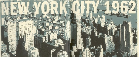
So this week’s Sunday picture is a detail of the frontispiece of Darwyn Cooke’s excellent graphic novel adaptation of the first of Donald Westlake/Richard Stark’s Parker books, The Hunter (Powells,Amazon, B&N). It’s not typical of the art in the graphic novel itself (see here for a preview), but it does reflect an interesting choice on the part of the artist. Like many other long series of genre novels, the Parker series gradually become unstuck in time – time advances more or less as it does in the outside world, but Parker doesn’t age nearly as he should. He should be at least in his early seventies in the final books in the series, but rather obviously isn’t. The last couple of books recognize this – the world of the Internet and money flowing backwards and forwards across electronic networks is not Parker’s world anymore, and the author says as much.
So when Cooke starts the book with a specific date (the date that _The Hunter_ first appeared) and draws the book in a style that borrows heavily from 1960s popular art, it is a deliberate choice. One could interpret Cooke’s frontispiece in at least two ways. One is as a decision to situate Parker again in his particular historical milieu. Cooke is contracted to do three more of these – if this is what he wants to do, one imagines that the successive volumes will either be the immediate sequels to _The Hunter_, or, if not will show Parker aging normally. The other possibility is that Cooke is embracing rather than rejecting the Parker series’ idiosyncratic chronology. This might see, for example, the follow ups set in different decades, with appropriate period drawing styles and an unaging (or only slightly aging) Parker. The second possibility seems a little more interesting to me than the first, but the first would have its virtues too.

{ 5 comments }
otto 09.13.09 at 6:18 pm
I like CT’s intermittent Parkerisms.
Sam C 09.13.09 at 9:27 pm
I like this – the preview pages are a very precise wordless rendition of the opening section of the novel (which I’ve just reread). But I’m less keen on how Parker looks: perhaps I just can’t see him as anyone but Lee Marvin.
Anon 09.14.09 at 12:15 am
Sam C,
Cooke has written of the difficulty of picturing Parker in various places (example). But the choice he went with seems to be inspired by Westlake’s comments that in the early days he pictured Parker as looking like Jack Palance. I don’t think Westlake had strong feelings about Marvin either way.
Barry 09.14.09 at 1:22 am
It *is* a nice rendition; the story is told with very little conversation.
karen marie 09.19.09 at 5:27 pm
It was my understanding that Westlake couldn’t stand Lee Marvin and was not at all happy with him being cast as Parker. What a shame Westlake died . There are a lot of things I would love to ask him about his writing. He had quite the imagination.
Comments on this entry are closed.