I’d almost be happier if this turned out to be some kind of fake. But in the meantime, while you may think of it as a badly flawed and unfair pie chart, I prefer to see it as actually just an extreme version of a genuine pie chart.
by Kieran Healy on November 25, 2009
I’d almost be happier if this turned out to be some kind of fake. But in the meantime, while you may think of it as a badly flawed and unfair pie chart, I prefer to see it as actually just an extreme version of a genuine pie chart.
{ 55 comments }
Natilo Paennim 11.25.09 at 8:45 pm
In my mother’s family, the Xmas tradition was always to have at least one pie per guest expected for Xmas Dinner. So Fox News isn’t even up to that standard yet.
Substance McGravitas 11.25.09 at 8:56 pm
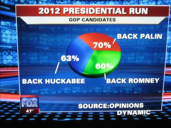
Back Palin and Back Romney are two plausibly-named individuals in both those respective families.
Miriam 11.25.09 at 8:57 pm
I think this wins the internet today.
djw 11.25.09 at 9:05 pm
My first thought was, yes, it really is stupid that such a high percentage of people would back tools like these candidates…
Doesn’t top the “Lincoln-Douglass debate?” graphic, though: http://matthewyglesias.theatlantic.com/lincolndouglass.jpg
Doctor Slack 11.25.09 at 9:19 pm
@djw: What’s being asked with that image? Whether one guy was secretly the other guy in disguise?
Matt 11.25.09 at 9:20 pm
I think this sort of thing might have been what Bush had in mind all those years ago when he said he wanted to “make the pie higher”.
Jamie 11.25.09 at 9:29 pm
Where did you get this, Kieran?
engels 11.25.09 at 9:43 pm
“Most economic fallacies derive … from the tendency to assume that there is a fixed pie, that one party can gain only at the expense of another.â€
—Milton and Rose Friedman, Free to Choose
Myles SG 11.25.09 at 9:48 pm
The really frightening thing about this is the implication of how Fox News actually constructs its pie charts. As it is clearly not remotely possible to enter into Excel or some other program pie chart numbers adding up to more than 100%, it means that whatever representations, based on actual numbers, they had for pie charts were not actually computer-generated, but just produced ad hoc. This casts doubt on the reliability and veracity of all graphical statistical representations presented on Fox News.
NomadUK 11.25.09 at 9:49 pm
‘In this graph, this column represents 23 percent of the population. This column represents 28 percent of the population, and this column represents 43 percent of the population.‘
‘Telling figures, indeed.’
MarkUp 11.25.09 at 10:08 pm
Here we see, graphically, the power that ACORN has unleashed. You can’t say they didn’t warn us.
P O'Neill 11.25.09 at 10:09 pm
ACORN is surely involved in this manipulation.
Nick Barnes 11.25.09 at 10:40 pm
I expect that some polling company asked some people – registered Republican voters? – the set of questions “Do you think X should run for the Republican presidential nomination in 2012?”, for X ∊ {Palin, Romney, Huckabee}. And they got 70% saying yes for Palin, 60% yes for Romney, 63% yes for Huckabee. And this graphic is not a bad presentation of those results. Still very, very funny though, and quite reassuring that the GOP is doomed in 2012. Would be bettter drawn on a chalkboard by Glenn Beck.
Substance McGravitas 11.25.09 at 10:42 pm
Are they?
LP 11.25.09 at 10:42 pm
LP 11.25.09 at 10:44 pm
Gah, screwed up the blockquote. What I meant to say:
This may be clear, but it is incorrect. If you type those three datapoints into excel, it will make you a pie chart. If you ask it to use “value†instead of “percentage†to label the slices, you will get a chart that looks not at all unlike the one above. That does not defend the innumeracy of whoever let this on the air, but as a question of execution, it takes approximately 15 seconds to verify this is easy to do. 15 seconds that are, admittedly, better spent fulminating about the bizarre technology Fox uses and casting doubt on ALL THEIR CHARTS, EVA!
Phil 11.25.09 at 10:53 pm
this graphic is
nota bad presentation of those resultsFixed that for you. Seriously, this graphic is an eye-wateringly bad presentation of those results. The words and numbers aren’t a bad presentation of the results, but the graphic is beyond dreadful.
Ginger Yellow 11.25.09 at 10:54 pm
This casts doubt on the reliability and veracity of all graphical statistical representations presented on Fox News.
Fox News casts doubt on the reliability and veracity of all graphical statistical representations presented on Fox News.
andrew 11.25.09 at 10:57 pm
My guess is that the graphic is pulling the numbers from this poll, conducted by Fox and Opinion Dynamics (although the graphic gives the source as “Opinions Dynamic”). The numbers in the graphic correspond to the poll results for the favorability ratings among Republicans for those three candidates. I didn’t do a very thorough search, but it seems to be the most recent Fox poll with those numbers for those potential candidates.
Of course, this would mean that someone would have had to take a question about favorability and mistake it for a question about who someone would back in 2012; then misunderstand how pie charts work, to the extent that they work, and throw the numbers into a pie graphic; then misspell the source of the poll results. So maybe there’s a simpler explanation.
Ben Alpers 11.25.09 at 11:18 pm
Is “Back Palin” what they call Canadian Palin in Canada?
djw 11.26.09 at 12:02 am
Doctor Slack,
At some point during the 2008 campaign, McCain was pressing for more debates. He publically called for a series of debates between himself and Obama akin to the famous Lincoln-Douglas debates in frequency and length. When FNC reported McCain’s proposal, this is the graphic they came up with.
parsimon 11.26.09 at 12:42 am
Oh, man. Delightful. Thanks, Kieran. (I needed that.)
Dick Sindall 11.26.09 at 1:24 am
The graphic is stupid, but stupid like a Fox. Mathematically, it’s meaningless, but as a visual for angry, frustrated, shame-ridden people who can’t stand having a “well, you know” president, it suggests that all three Republicans have strong favor with approval ratings above President Obama’s. That the numbers are meaningless and the comparison with the president’s way beyond apples and oranges doesn’t matter to the true believer.
Yeah, I tried it in a spreadsheet, and if you plug in the numbers manually, you’ll get the pie chart. Of course, the sheet converts them to relative numbers with a total of 1, not 1.93. The spreadsheet doesn’t work with 694.8-degree circles.
vivian 11.26.09 at 1:43 am
thanks for the hilarity.
Doctor Slack 11.26.09 at 1:55 am
“akin to the famous Lincoln-Douglas debates in frequency and length.”
Oh, man. How did I miss that? Priceless.
John S. Wilkins 11.26.09 at 2:21 am
You have all missed it: this is a non-Euclidean pie chart. It’s like all those sports coaches who demand 110% from their players – they are on a saddle point in Riemannian space.
Alex 11.26.09 at 2:22 am
This is real.
The question was:
“I’m going to read you the names of several individuals. Please tell me
whether you have a generally favorable or unfavorable opinion of each one.”
Notice nothing about “2012” or anything. So the title on the graphic is wrong already.
And the percentages in the pic are for the favourability ratings of them from those who consider themselves to be Republicans.
Oh, and the source was not “Opinions Dynamic”, but “Opinion Dynamic”.
So yeah, the percentages are correct (but for a subset of those answering a different question to what the pic seems to portray), but certainly shouldn’t be portrayed in a pie chart.
Alex 11.26.09 at 2:22 am
Oops. Sources:
http://www.foxnews.com/story/0,2933,575854,00.html
http://www.foxnews.com/projects/pdf/112009_palin.pdf
Alex 11.26.09 at 2:24 am
I also like how the pdf is named after “palin” (shows you their priorities), and is in their “projects” section. That just makes me think of 9/12 projects, or teabagger projects.
Spiny Norman 11.26.09 at 2:56 am
Baby Got Back!
Hudson 11.26.09 at 3:27 am
That pie chart is the statistical equivalent of the Spinal Tap amp that went to 11.
Phillip Hallam-Baker 11.26.09 at 3:52 am
Actually it is quite easy to create a pie chart in excel from more than 100%. I guess they asked non-exclusive questions, as in would you back X as candidate.
It would make sense as some sort of chart, but not as a pie chart.
For all the sturm und drang that the teabaggers go in for, I don’t think that there is the remotest chance it will help them in the least. While folk don’t much like a sour economy, they like groups of zealots exhibiting a strong sense of entitlement rather less.
The Democrats could easily get five times the number of people reved up like the tea baggers are. The reason that they don’t is that you don’t win elections by putting crazy people in front of the news cameras.
JK 11.26.09 at 4:31 am
all I know is that the GOP is promising me almost two pies for every one liberal pie. do the maths.
slg 11.26.09 at 4:58 am
Gingrich is 58% favorable in the same poll! Shouldn’t he be in the pie chart too? Then it would correctly represent, let’s see… 251% of Republican respondents.
paulo 11.26.09 at 5:13 am
Man if 193% of conservatives back one of those three that only leaves like less than eleventyseven percent for anyone else. Talk about starved for oxygen.
Scott 11.26.09 at 5:28 am
Hudson,
I like the image of an amp with three volume knobs that go to 6, 6, and 7.
John Holbo 11.26.09 at 5:32 am
In this time of recession, only the Republicans can promise us two pies in every pie!
Alex K. 11.26.09 at 5:39 am
“The Democrats could easily get five times the number of people reved up like the tea baggers are.The reason that they don’t is that you don’t win elections by putting crazy people in front of the news cameras.”
Tell that to the Democratic gubernatorial candidates in Virginia or New Jersey. Or to the independent voters who are rather heavily against the Democrats.
I think you underestimate the ability of an angry mob to partially frame the debate — the average voter is really not much more sophisticated than the average tea-bagger.
John Holbo 11.26.09 at 6:35 am
Also, what does this do to the old, standard theory of the crazification factor being 27%?
Henri Vieuxtemps 11.26.09 at 8:04 am
In this time of recession, only the Republicans can promise us two pies in every pie!
Ah, this reminds me of an old joke. Military academy, Colonel writes on the board: …and therefore sin(x)=1.2. Student raises his hand: “sorry, Comrade Colonel, but it can’t be 1.2; it’s impossible for a sine to be greater than one.” Colonel: “sit down, young man, and remember: it may be hard, but nothing’s impossible. In fact, during The War it used to go as high as seven!”
James Dennis 11.26.09 at 9:08 am
Did they just divide the circle into three parts and then stick the favorability ratings on there without regard for the standard meaning of pie charts?
ajay 11.26.09 at 9:28 am
you may think of it as a badly flawed and unfair pie chart, I prefer to see it as actually just an extreme version of a genuine pie chart.
I see what you did there.
…well, we could argue for ages over whether it’s a “lie” or the “truth”, but really all we’re doing is playing with Somantics.
mollymooly 11.26.09 at 10:39 am
Why does Romney’s green 60% appear bigger than Palin’s red 70%?
I guess red doesn’t make her base look big.
Kenny Easwaran 11.26.09 at 11:22 am
mollymooly – that’s just a trick of perspective. Note that Palin and Romney’s regions meet in basically a horizontal line at the right, if not one that is slightly tilted downwards. On the other end, her region clearly has a greater angle from vertical than his. So the angle in her wedge is definitely greater than his. The fact that his seems to take up a larger fraction of the image is presumably only because the circle is tilted away from us, so Palin’s region looks smaller due to perspective. (Yes, this is a pie chart in three-dimensions.)
Newstech 11.26.09 at 1:47 pm
Three dimensions? I would have thought at least four.
cc 11.26.09 at 2:01 pm
my guess is that FN did this intentionally, like labeling scandal ridden republicans with a “D” in the graphic. they know their viewers. now many will spend their thanksgiving talking about how 60 to 70 percent of the people support one of these three for president.
UncleJohn 11.26.09 at 4:54 pm
I predict Back Romney will by over 70% by the end of the third half of the year.
AlwaysLooking4Truth 11.26.09 at 10:58 pm
The poll numbers make since, but the pie chart?!…..Either some people don’t know how, or when, to properly use a pie chart, or they thought that it would be creative to put the numbers in a “pie form” for a visual not intending to use it as a true “pie chart” either way, a very dumb idea….. Imagine if we were to search the affiliates of the other networks (as this is an affiliate of FOX not the network FOX NEWS itself) I have no doubt we would get a buttload of this type of stuff, but then again what fun would that be for some…………
dionysus hawksby 11.27.09 at 10:32 am
This is a terrible representation of whatever data points the fox news came up with. The graph says, “70% back Palin”. Is the part of the circle represented by Palin backers (presumably the red part) make up of 70% of it’s area? Clearly not. A pie chart is just an idiotic choice for this particular chart. A bar chart would have been much better and clearer. But what else can you expect from innumerate morons at Fox?
Jeff 11.27.09 at 6:50 pm
Reminds me of an old cartoon…. Dilbert: “I did the analysis using your bad assumptions. Then I applied your flawed logic and arrived at your predetermined answer. Shall I begin disillusioning the team?” Boss: “This needs a piechart.”
marta-NY/NJ 11.28.09 at 10:41 pm
I love your answers…I specially love the one that shows that the pie chart adds up to over 100%..that’s Republogic! the art of manipulation!
NewsJunky 11.29.09 at 8:47 am
HeyKieran,
Nice catch. But sorry to say, can’t blame FOX NEWS for this one, just a local FOX channel affiliate. A big difference. Try again!
TW Andrews 11.30.09 at 9:23 pm
Someone alert Stephen Few!
lol?? 12.01.09 at 5:18 am
…
Either they are truly stupid, and dont understand a pie chart, or they are making a (poor) stacking chart. For instance, someone can support BOTH Palin and Huckabee, and thus the percentages end up overlapping, and stuff like that. I’m too lazy to write out a mathematical explanation, but ya, you should get the point.
Joel 12.01.09 at 11:04 pm
As stupid as the graphic is, it’s not FNC. It’s something from the local news broadcast on WFLD Chicago, the local fox affiliate. Nice try though.
Comments on this entry are closed.