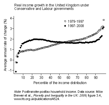
 Matt Yglesias and Brad DeLong have argued that this graph, from Lane Kenworthy, shows that we shouldn’t be too critical of Labour’s performance with respect to inequality over their 12 years of government in Britain.
Both Matt and Brad are pushing back against Chris's post below, which argued that Labour had done very little about equality. (Although in his remark on my comment on his post, Brad now seems to suggest that his post was a pre-emptive strike against what Chris would go on to write in comments.) There’s a natural rejoinder on behalf of Chris, which has been well made in both Matt and Brad’s comments threads. Namely, if the graph really showed that things had gotten better, equality-wise, the Gini coefficient for the UK would have fallen. But in fact it rose, somewhat significantly, over Labour’s term. Indeed, the IFS Report that the graph is based on shows quite clearly that it rose markedly towards the end of Labour’s term.
So I got to thinking about how good a measure Gini coefficients are of equality. I think the upshot of what I’ll say below is that Chris’s point is right – if things were really going well, you’d expect Gini coefficients to fall. But it’s messy, particularly because Gini’s are much more sensitive to changes at the top than the bottom.