Yay, I found my lost copy of The Lost Art of Heinrich Kley, volume 1. And my first post got such a good response – one comment, and counting! – that I had to do a follow-up.
Here is the cover of my copy of Der Herr der Luft [Master of the Air], a 1914 anthology of ‘tales of fliers and airtravellerstories’ [Luftfahrergeschichten].

[Click for larger]
It’s illustrated by Kley, and you can find the various plates in Lost Art, vol. 1. But for some reason they left out the cover illustration. (Or you can download the book from the Internet Archive. But, again, the cover image is omitted.)
Why do I like the cover so much?
It is, I believe, the first occurrence of a phenomenon that would become tragi-comically common, in the decades to come: a fantasy or science fiction book – especially an anthology – with a cover that promises some way cool [am oberaffengeilsten] story that isn’t actually in the book. Usually the book is ok, of course. But there is a special, bitter-sweet feeling in the soul of a 12-year old boy (mostly boys, but I by no means hereby deny the existence of female nerds) when you realize you aren’t going to get to read that awesome story about the naked airdude (probably he is wearing a tarzan loincloth) and his friend, the fierce flying fish dude. You will just have to wait until Mike Mignola invents Abe Sapien to read about anyone who looks half that good. (And even Abe can’t fly.)
Here’s the table of contents for the volume.
Der Kondor. Adalbert Stifter
Der Türmer Palingenius. Karl Hans Strobl
Hans Pfalls Mondfahrt. Edgar Allan Poe [trans. “The Unparalleled Adventure of One Hans Pfall”]
Der Unheimliche Gast. Jules Verne [transl. “Un drame dans les airs”]
Luftpilot Jacquelin. Otto Rung
Die Geliebte. Karl Vollmöller
Geflügelte Taten. Hermann Heijermans
Die Reife um die Erde in vierundzwanzig Stunden. Maurice Renard
Das Flugtreffen von Ardea. Gabriele d’Unnunzio
Die Melodie der Sphären. Jage von Rohl
Das Lebendige Mastodon. Paul Scheerbart
Der Ozeanflug. Leonhard Ubelt
Der Flieger. Wilhelm Schmidtbonn
Die Luftschlacht am Niagara. H. G. Wells
Der erste Mensch. Alfred Richard Meyer
Now, I have a confession to make. I actually haven’t read it. Much of it, anyway. The blackletter type stabs my eyes, and my German is weak after years of disuse. But I’m reasonably sure there’s no flying fish man to be found, because fish guys are just one of Kley’s go-to motifs. He likes ’em. He likes ’em in Victorian bathing outfits (fishman and mildly nsfw lady under the fold.)
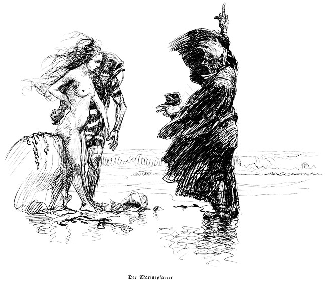
I like this stuff. But, even more, I like the idea that, in 1913 or thereabouts, someone hired Kley to add visual snazz to their book of translated Verne and Wells and Poe and assorted German authors, and he was bold enough to draw a flying fishman. He was ahead of his time.
I am thinking of trying to read Der Türmer Palingenius, by Strobl. I read about him somewhere. A gothic or horror writer who turned Nazi and came to a bad end. But he was the editor of Der Orchideengarten, allegedly the first fantasy magazine.
{ 17 comments }
Alex 04.15.13 at 10:47 am
You want sinister fish-men of the Belle Epoque? The Musée du Quai Branly brings the eight-foot tall fishman and god of the storm at sea, as realised by the craftsmen of the Dahomey Kingdom between 1890 and 1892 and shipped to France in the train of a victorious colonial baroudeur, there to be left gathering dust in the basement of the ministry of colonies’ archive until President Jacques Chirac’s aspiration to shape the cityscape of Paris set it free to throne over crowds of unsuspecting tourists.
The photo doesn’t really do its Lovecraft/Strossian presence justice. (Question: was Lovecraft, like so many interwar artists, for example Picasso or Matisse, inspired by the exoticising influence of art primaire?)
herr doktor bimler 04.15.13 at 11:02 am
Der Orchideengarten, allegedly the first fantasy magazine.
Shirley an influence on Gorey’s “The Evil Garden”.
I am impressed how many of the illustrations at the 50-Watts link manage to look like Alfred Kubin’s work even when they aren’t.
G J Murphy 04.15.13 at 3:01 pm
Flyingfish looks Imperial German Taube aircraft.
pedant 04.15.13 at 4:38 pm
“Die Reife um die Erde in vierundzwanzig Stunden”
would sure make a lot more sense as “Die Reise”.
(i.e. “the 24-hour Round-the-World Maturity!” vs. “the 24-hour Round-the-World Trip!”)
Any chance that the type-face has led you to mistake an ‘s’ for an ‘f’?
Lawrence L White 04.15.13 at 4:52 pm
I will comment for better response. 50-Watts is a totally awesome site.
dbk 04.15.13 at 5:53 pm
@pedant
Right, the letter is an Eszett, hard s/z. Anyone recognize the font on the cover?
pedant 04.15.13 at 10:13 pm
dbk @5–
okay, I had a look at the book online.
I wouldn’t say it’s an Eszett, and that’s just as well since “die Reisse” wouldn’t really be a word. Just an “s”, in a variant lower-case form that looks like an “f”.
Die Luftschlacht am Niagara. H. G. Wells–I imagine that’s an excerpt of this:
http://en.wikipedia.org/wiki/The_War_in_the_Air
which features an aerial battle over Niagara Falls.
John Holbo 04.15.13 at 11:10 pm
Die Reife is obviously supposed to be Die Reise.
John Holbo 04.16.13 at 12:48 am
For those curious, if you check the Internet Archive link and give a look at the table of contents, you can sample some gnarly Fraktur. The ‘s’ looks like ‘f’ thing is familiar, even from old English print, so that was just a typo. The only one that puzzles me is the ‘H’ in ‘Hans Pfalls’. It looks like a ‘G’ or an ‘S’ or a numeral ‘5’. Anything but an ‘H’.
http://archive.org/stream/derherrderluftfl00adeluoft#page/n7/mode/2up
pedant 04.16.13 at 1:11 am
Just think of it as an elaboration of a lower-case ‘h’. Start from that shape, and it doesn’t look so odd.
Stephen Austin 04.16.13 at 1:41 am
I think the typeface is Schwabacher, rather than Fraktur.
John Holbo 04.16.13 at 1:52 am
Yes, but it looks non-standard. You aren’t supposed to haul off and invent new letterforms, even as elaborations of familiar ones! (Of course people make weird fonts for Roman letters all the time, by elaborating familiar forms in a theme-and-variations way. I just find reading this sort of thing a challenge.)
John Holbo 04.16.13 at 3:12 am
“I think the typeface is Schwabacher, rather than Fraktur.”
Yep, you are right. Wikipedia says:
“The lower case g and the upper case H have particularly distinctive forms.”
http://en.wikipedia.org/wiki/Schwabacher
Thus the pun in my title needs to be changed, but nothing comes to mind.
Learn something every day.
pedant 04.16.13 at 10:23 am
Gyre and Gimble in the Schwabe.
Peter Hovde 04.17.13 at 3:00 pm
“It’s beginning to look a lot like fishmen”
Gene O'Grady 04.17.13 at 3:06 pm
Just on the basis of the publications I have (a modest if quite peculiar assemblage) it has been my impression that the German typefaces (which I guess I’m not quite right in grouping under the heading Fraktur) got a lot harder to read in the 1900-1914 period. I’ve got some things with type like that in the place and publisher on the cover, and they don’t look like earlier material I’m familiar with.
Again over my head, but it’s my impression that readers would have expected the cover illustration to be symbolic and not an illustration of a piece they were going to be cheated out of.
Joe Procopio 04.20.13 at 8:35 pm
Thanks again for mentioning my recent “Lost Art of Heinrich Kley” books on your blog! I didn’t include the cover image you cite because for some reason the copy of “Der Herr der Luft” in my collection is missing that drawing (I’m starting to suspect that my copy may have been rebound at some later date). Regardless, you’re right…that is a really cool image!
Warm regards,
Joe
Comments on this entry are closed.