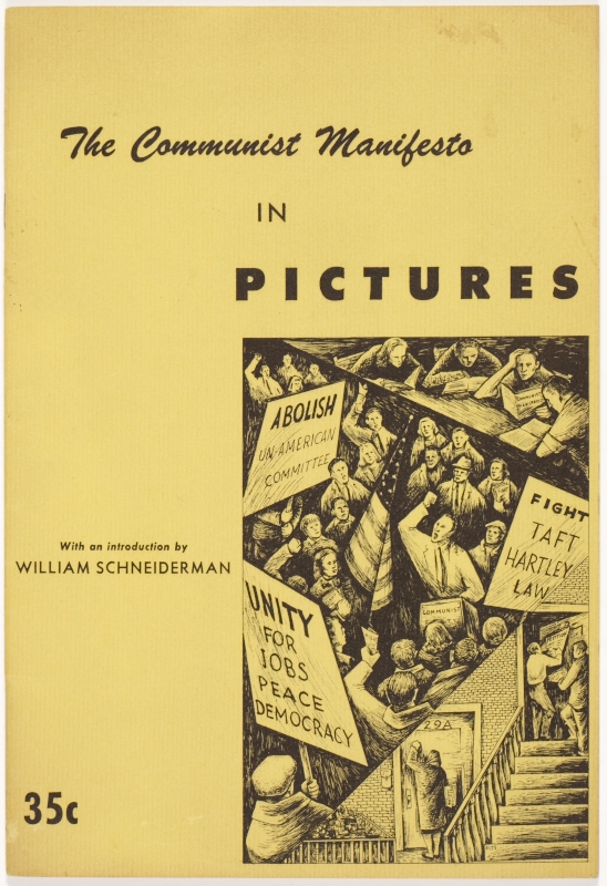
I just added an item to my collection of graphical curiosities: a 1948 pamphlet, published by The International Book Store in San Francisco, “The Communist Manifesto In Pictures”.

You can get the PDF version for free. I’m interested in it mostly as a data point in the history of American graphic design. The International Book Store seems to have had some graphical flair:
I don’t own that one. I don’t imagine the contents – apparently republished from Soviet Russia Today – are as fun as the cover.

{ 5 comments }
js. 05.13.16 at 4:27 am
Holy shit, Holbo, this is the kind of stuff I can totally get into! Thanks. (It’s not quite an, oh I don’t know, an El Lissitzky collection—but still great.)
Also, is the International Book Store in SF associated with International Publishers? I guess I could look this up, couldn’t I?
Jim Fett 05.13.16 at 11:21 am
Lorne Bair (lornebair.com) specializes in that kind of stuff. A lot of it is relatively affordable (for rare books). No affiliation, I just like the catalog. Ymmv.
Ken MacLeod 05.14.16 at 10:52 am
This is the ugliest illustrated version of the Manifesto I’ve ever seen.
F. Foundling 05.17.16 at 12:55 am
The title seems a bit misleading, I thought the pictures would actually illustrate the text or even attempt to convey its message visually in a condensed way. I remember that there used to be a Soviet comic book history of the October revolution (published in 1987), which I now see can be found online in Spanish translation under the title Asà fue la revolución rusa 1917. Even more intriguingly, I find that the same Soviet publishing house has also produced a 1991 comic book version of Engels’ ‘The Origin of the Family, Private Property and the State’! Those interested can google the Russian title “ПроиÑхождение Ñемьи, чаÑтной ÑобÑтвенноÑти и гоÑударÑтва” (комикÑ). Obviously, in view of the subject matter, it’s not *quite* safe for work.
John Holbo 05.17.16 at 6:34 am
“The title seems a bit misleading, I thought the pictures would actually illustrate the text or even attempt to convey its message visually in a condensed way.”
I was hoping for that myself. I agree with Ken that it is definitely the ugliest illustrated Manifesto, which is fine. But I was hoping for something even better.
Comments on this entry are closed.