A bit of mindless surfing had me looking at the execrable Instapundit for the first time in ages … but there was actually something interesting there: a link to Sally Mann, talking about memory, uncertainty and the collodion process. Those 19th-century photographers who managed to produce near-flawless images using the process were really something.
From the category archives:
Arts
In the course of an interesting piece by Richard Dorment in the NY Review of Books on the authenticity or otherwise of works by Andy Warhol, I came across a striking passage
The single most important thing you can say about a work of art is that it is real, that the artist to whom it is attributed made it. Until you are certain that a work of art is authentic, it is impossible to say much else that is meaningful about it.
Is this a reasonable claim about art in general? How important is authentic attribution in, say, literature or music?
[click to continue…]
Merry Christmas and a Happy New Year!
Well, not quite yet (you might remonstrate).
But it’s coming up (you must concede). So I’ve undertaken a seasonal graphic project that doesn’t involve Photoshopping squid. I love Dickens, and “A Christmas Carol” isn’t the only good Christmas story he wrote. I also like all the old, original illustrations for his books and stories. But they tend to be printed on cheap paper, and at small sizes. So I have kindly taken the trouble of scanning them in at high resolution, cleaning them up and generally making them easier to see and appreciate in all their glory. Really, a lot of these images are full of fun little details.
For tonight, two tales worth. First, “A Christmas Carol”. Second – I love the wild title page and frontispiece for this one – “The Chimes”. A New Year’s tale, technically speaking. “A Goblin Story of Some Bells that Rang an Old Year Out and a New Year In.” Kind of an odd tale, really. (As one of my fellow Valve bloggers noted last year: the moral is a bit nuts. But I still love it.)
Obviously not just these old images but the stories themselves are very much in the public domain, hence available from lots of sources as well as your local, friendly neighborhood bookstore or library. Discuss!
 Via my cousin Ronan, Dublin City Council on how to get to, or not get to, the new Samuel Beckett Bridge.
This post is going to have it all: comics, fonts, broadbrush high-lowbrow cultural opinionation, curiously reasonably priced British TV.
We’ll start with fonts. Why did the modernists go ga-ga for sans serif? Take Tschichold, my recent subject of study. Early in his career, he dogmatizes that there is something technically obligatory, inherently suited to the Engineering Age, about sanserif type. What induced him to make such an implausibly strong claim, and induced others to buy it, was somehow a tremendous aesthetic impulse in this direction. This felt so necessary. Human beings aren’t skeptical of arguments that give them exactly what they want, so bad arguments are often most interesting as indices of desire. But what was the Big Deal with filing down all the little pointy bits, all of a sudden? [click to continue…]
Gotta change things up, keep things fresh. This video is fantastic and highly educational. It teaches you how to whittle your own 19th Century dictionary, using only string, a turnip, and a clamp. But first you have to make your own Linotype machine. It’s much easier to go here and just win one of these beautiful artifacts of book artistry. (You will have to be lucky, however.) [click to continue…]
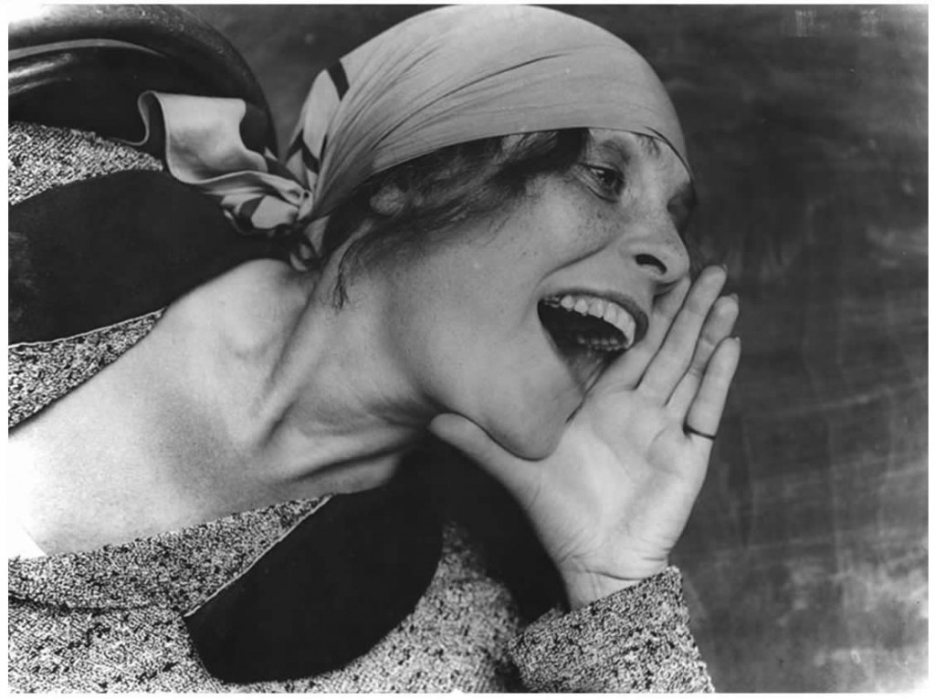
We announced a while back that we’d be doing a regularish photo slot on Sundays, so here’s an offering for today, sparked by no better reason than that I was leafing through a large compendium of photos of the 20th century yesterday (some famous, some not) and I was arrested by Aleksander Rodchenko’s portrait of Lilya Brik. Reused, recycled, copied, imitated, parodied, the original still has the capacity to make me stop and wonder at it. Such energetic, dynamic composition in the picture, and such optimism and vigour in the woman depicted.

I snagged another good comics history recently. A History of American Graphic Humor, vol. 2: 1865-1938 (1938), by William Murrel. (You could get it through Abebooks; but I bought the last cheap copy. Sorry.) They sure liked to make fun of Oscar Wilde, back in the day. [click to continue…]
I was kind of surprised to see that the wonderful Tom Russell has a long essay on some new blog called The Rumpus, all about Juarez, El Paso, drug wars, borderlands, corruption, et cetera. I love his music, and I like his writing too, so I’m always pleased to see some more of it. The content, though, the content is shocking.
bq. I turned that page in section B where there was a short item about two El Pasoans slain yesterday in a Juarez bar shooting. Back page stuff. Hidden near the end of the story was the astounding body count: _nearly 2900 people, including more than 160 this month alone, have been killed in Juarez since a war between drug traffickers erupted January 2008_ . John Wesley Hardin wouldn’t stand a chance.
Jesus. You’re probably safer in Kandahar.
Some amazing time lapse sequences of glacier retreat and a spectacular ice-shelf collapse:

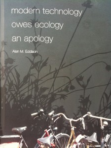
Sometimes you make a picture that you feel like sharing. Quiet Sundays are a good time to do so. Here’s one. It’s a wall painting, taken in a small street in Utrecht, with a row of bicycles in front of the wall painting. I love wall paintings – I prefer poetry on walls and windows rather than in libraries, and art outside in public spaces rather than in musea (the metal flowers carved in the pavement around St. John’s College in Cambridge are another example that makes me happy). Enjoy.
My Icerocket self-search (admit it, we all do it), led me to this marvellous project. The Invisible Library is a collection of books that don’t exist, except in the pages of other books. It is physically manifesting at the Tenderpixel Library in London, but will resume invisibility after 12 July.
The connection?
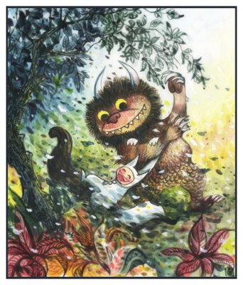
Have you seen this yet? Terrible yellow eyes. It’s an art project with various folks contributing Where The Wild Things Are -inspired works. It’s a lot of fun. This one, for example, by Alina Chau (whose blog is here):

I think this one might be my favorite, however. (By Adam Volker.) Which do you like best?
This “Andrew Sullivan link”:http://andrewsullivan.theatlantic.com/the_daily_dish/2009/03/mental-health-6.html to a Hexstatic song reminded me that Hexstatic and Coldcut’s “Timber”:http://www.youtube.com/watch?v=nLu7p9bTJ84 is surely the best video of all time, and that I should look for it again online (the last time I looked was a couple of years ago, before YouTube really got going). Found sounds meets mid-1990s-vintage video-editing tools and it’s awesome! Fools who disagree with this claim can of course nominate their preferred alternative in comments (and should even be able to embed YouTube links, I think) …
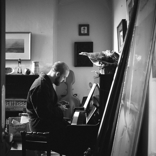
The Online Photographer reports that the firm of Franke and Heidecke is going out of business – perhaps permanently. That’s very sad news, for they are the firm that launched the famous Rolleiflex brand in 1929. As it happens, I bought a 1932 Rolleiflex Standard that I bought in a junk shop in Wales last year. I’d actually seen it a year before. The owner had spotted me with a camera and asked me whether I was interested in the Rollei. At the time I declined, but regretted it as I thought back to the beauty of the image in its ground-glass screen. So I was amazed, when I went back, to find it still unsold and snapped it up. I keep meaning to write a post about what you could, pretentiously, call the “phenomenology of technology”. The Rollei feels so different to a modern digital camera: since it is a twin-lens reflex, you hold it at waist level and look downwards; like other film cameras you don’t get the instant satisfaction of digital – you have to wait and see what came out; and since you have a mere 12 shots on 120 medium format film, you can’t just snap away and select for the best. There’s also the fact that is is a superbly made object. How many other machines made in 1932 still work, and work pretty well. Vorsprung durch Technik, I suppose. Here’s a photograph I made with it:
