Via Jim Gibbon I’ve discovered Gapminder. Wow! It’s a wonderful visualization tool for data. The focus is on world development statistics from the UN. The tool is incredibly user-friendly and let’s you play around with what variables you want to see, what you want highlighted in color, whether you want to log the data, what year you want to display, and whether you want to animate the time progression (oh, and how quickly).
I’ve made an example available on YouTube. (I used Gapminder to create the visualization and Hypercam to capture it.)
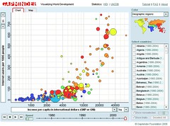
Here is some context for that particular graph. My first interests in research on Internet and social inequality concerned the unequal global diffusion of the medium. I wrote my senior thesis in college on this topic and then pursued it further – and thankfully in a more sophisticated manner – in graduate school. So this is a topic that has been of interest to me for a while and it’s great to be able to play with some visual representations of the data.
So what you have on the video graph is a look at Internet diffusion by income (logged) from 1990-2004. I picked color coding by income category, which is somewhat superfluous given that the horizontal access already has that information, but I thought it added a little something. (For example, to summarize the puzzle of my 1999 paper – the first to run more than bivariate analyses on these data -, it focused on explaining why all the red dots are so widely dispersed on the graph despite all representing rich long-term democratic countries.)
Thanks to the tool’s flexibility, you can change it so that the color coding signifies geographical region and could then tell immediately that what continent you are on – an argument some people in the literature tried to make – has little to do with the level of Internet diffusion.
Imagine the possibilities of all this in, say, classroom presentations. Jim links to a great presentation using this tool. (Although I disagree with the presenter’s conclusion at the end about the leveling of differences regarding Internet diffusion.)
I recommend checking out the tool on your own for maximum appreciation of its capabilities.
UPDATE: There is more! Conrad – Jim’s source on this – tells me that the tool on the Trendalyzer site has even more option. Moreover, you can download a beta version of the software that even lets you import your own data.
{ 1 trackback }
{ 8 comments }
derrida derider 06.28.06 at 6:42 pm
Gapminder’s stuff came out of a WHO-funded project at the Karolinska Institut. They’ve had various betas available on the web for some years – it was interesting to watch it grow in scope and flexibility (and I hope it’s development is not finished yet).
Congrats to the WHO for realising there is a real public good aspect to accessible data analysis and doing something about it.
Eszter 06.28.06 at 6:53 pm
Yes, I realize it’s not new, but I hadn’t seen it before, which probably means that many others hadn’t either so I thought it was worth a note. (I’m not suggesting you were claiming otherwise.:)
What a great tool for teaching purposes. While I realize that a certain level of appreciation for this tool may require one to be a geek, the point of the post’s title was to signal that in a presentation lots of students (or whatever audience) could get into and understand the material much better than trying to convey the information in other ways. It makes material really accessible. Of course, it’s still important that one use it with care.
Bill Gardner 06.28.06 at 7:14 pm
Very nicely done, Eszter.
Maynard Handley 06.28.06 at 7:23 pm
I’ll once again plug this video
http://video.google.com/videoplay?docid=7996617766640098677
which has the leader of the gapminder team explaining the project.
(Sadly it’s hosted by google video which has totally jumped the shark when it comes to handling videos longer than about 5 minutes. Good luck playing it or downloading it without something going wrong every five minutes.)
vivian 06.28.06 at 9:51 pm
Wow, cool. Must force self to sleep now, play later. ugh.
Eszter 06.29.06 at 12:39 am
Be sure to check out the links in the update above. Scary, even more options!
Joshua W. Burton 06.29.06 at 7:03 am
The Cambodian and Rwandan genocides stand out shockingly when animated, on several axes. (One dot leaves the pack in a disturbing plummet, and you find yourself hovering over it, concerned. “Hey, what’s wrong with you, little fella…? Who is this, anyway — ohhh.“) But two “false positives” also stand out, namely the collapse of the Soviet bloc and the liberation of southern Africa (SA, Lesotho, Swaziland, Zimbabwe). Both of the latter look almost indistinguishable from genocides by the blind financial and health measures we are graphing, which nicely underlines that statistics illuminate, but cannot replace, more qualitative historical analysis. It’s a pity Iraq isn’t in the dataset.
There are all sorts of little entertainments hiding in the data, too. Cheering Ireland on as it surges past the UK, for example, or watching Mexico rapidly catch up to its northern neighbors.
Ginger Yellow 06.29.06 at 7:17 am
Cool. Assuming you can do graphs with x, y and z axes, does this mean you could create 5 dimensional graphs using time and colour?
Comments on this entry are closed.