Via John Gruber comes news that the already somewhat odd augmenting of U.S. currency with larger typefaces and random bits of color has taken a horrible turn. Behold the new five dollar bill.
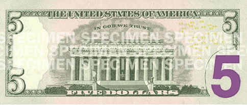
The new additions to this bill, apparently intended to increase legibility and accessibility, were made by my daughter, who is four. Or possibly by Harold and His Purple Crayon. Actually, as the folks at Hoefler & Frere-Jones point out, this monstrosity is in fact “the work of a 147-year-old government agency called the United States Bureau of Engraving and Printing. It employs 2,500 people, and has an annual budget of $525,000,000.”
Meanwhile in Britain, the design for their new line of coins was selected after an open competition and is the work of a 26 year-old designer who hadn’t tried his hand at coin design before.
{ 48 comments }
Steve LaBonne 04.04.08 at 3:10 pm
Just the other day I paid a cashier with one of these and she commented that she likes it because it’s “colorful”. So perhaps after all they hit the appropriate level of tastefulness for the general population?
Joseph 04.04.08 at 3:13 pm
Oof. This is terrible. The lower-right “5” evokes the mixed fonts of the Euro. Wonder if any cashiers are doubting the authenticity of these?
Donald A. Coffin 04.04.08 at 3:17 pm
I believe the big purple 5 is designed to help people who are vision impaired.
And speaking of that, we are the only country I know of that goes out of its way to make our paper currency impossible for the blind–it’s all the same size. Does anyone remember the scene in “Ray” which depects Ray Charles insisting on being paid in $1 dollar bills? Kept him from being cheated.
In every country (that I know of) except this one, the larger denomination paper currency is on larger pieces of paper. Which makes a huge amount of sense to me.
sglover 04.04.08 at 3:20 pm
Well, at least they’re getting away from drab green.
Also, those British coins, erm, suck. At a minimum, shouldn’t the size of the coin correspond to the quantity it represents? And I’m guessing the oddball polygonal coins are destined for mass loathing.
Chris Stiles 04.04.08 at 3:22 pm
And also incredibly good at boreing holes in pockets.
Katherine 04.04.08 at 3:24 pm
Mass loathing? Erm, no. I suppose, if I had to give reason why I don’t loathe the coins, it’s that they are extremely easy to identify.
P O'Neill 04.04.08 at 3:25 pm
They’re making room for future zeroes, the logical consequence of fiscal policy under George W. Bush.
Mike 04.04.08 at 3:27 pm
Purple and green…maybe the Joker is running the Mint. If there’s a sudden rash of hysterical-laughing fits leading to death, we know where to look.
Jeff 04.04.08 at 3:28 pm
What’s wrong with it? The enhancements, like the colors and watermarks were mostly anti-counterfeiting tactics, not “accessibility”, whatever that means in this context. The large 5 is for the benefit of those with weak vision.
Different-colored currency will help reduce the likelihood of accidentally giving or getting the wrong bill. Other countries, including, I think, Canada and much of Europe, have been doing this for years.
Adrian 04.04.08 at 3:37 pm
@sglover: Only the engraving on the British coins is new. Brits have been putting up with oddball polygonal coins and (like Americans) odd size/value relations since at least decimalisation.
alkali 04.04.08 at 3:38 pm
I believe the big purple 5 is designed to help people who are vision impaired.
And to injure those of us who are not.
In seriousness, it is of course appropriate to design currency with the visually impaired in mind, but there is no reason it can’t be attractive. This is the graphic design equivalent of the makeshift plywood ramps we used to see on historic buildings just after the ADA was enacted in the US.
Rich B. 04.04.08 at 3:39 pm
Not obvious from the picture, of course, is that if you squeeze the purple spot on the new currency, the voice James Earl Jones will state, “This is a five dollar bill.”
McDuff 04.04.08 at 3:55 pm
sglover @ 4
It sounds like you’re unaware of this, but the shapes of the coins are not changing at all. We’ve had seven-sided coins in the UK since 1969 and, so far, mass loathing has failed to break out. The 50p and 20p coins are brilliant designs, as it happens, being both easily identifiable to the blind and vending machine friendly.
As far as the Big Purple Five goes, since when did accessible have to mean ugly? You can have designs that work well for partially sighted people without resorting to big garish child text.
belle le triste 04.04.08 at 3:56 pm
the new brit coins look great!
and the size thing predates decimalisation — 1 penny and halfpenny were bigger than a shilling, 6d was tiny, thruppence had 12 sides and was fat, groats — er ok i don’t recall what groats looked like
Righteous Bubba 04.04.08 at 4:03 pm
Please send me some examples of this currency so I can evaluate it.
Kathleen 04.04.08 at 4:10 pm
Alkali — You might enjoy the work of Tobin Siebers.
RB, you de funny.
rm 04.04.08 at 4:21 pm
Rich B. wins.
Please tell me this is the most elaborate April Fools joke ever — put off until the 4th just to make it sneakier.
I guess the big numbers on the 20 and 10 weren’t working, and I fully support accessibility, but can I get some SERIFS????
Misha 04.04.08 at 4:35 pm
“What’s wrong with it?”
Um, it’s hideous?
Alex 04.04.08 at 5:15 pm
I know! It’s so the denomination can be regularly updated to take account of the dollar’s falling value!
Wrenkin 04.04.08 at 5:27 pm
In every country (that I know of) except this one, the larger denomination paper currency is on larger pieces of paper. Which makes a huge amount of sense to me.
Canadian money is all the same size. It does, however, come in different colours, with large numbers printed in rough ink IIRC, and there is also braille.
voyou 04.04.08 at 5:30 pm
The sizes of British coins do correspond to their value: you have a big and a little copper coin (1p, 2p); a big and a little round silver coin (5p, 10p); a big and a little heptagonal silver coin (20p, 50p); and a big and a little thick goldish colored coin (£1, £2).
giotto 04.04.08 at 5:32 pm
The new brit coins look like cufflinks; but that is far better than the newer US coins, which look like cheap carnival tokens (due mainly to the shallow relief. Compare a new quarter to an old one and tell me how you can continue to have faith in America. . .). Did someone decide that as long as our money was declining in value we might as well subject it to an aesthetic decline as well? Or is this just a rich coincidence??
Kenny Easwaran 04.04.08 at 5:42 pm
This is real, and not an April Fools joke?
I do remember hearing that they would increase the size of the numbers to help those with poor vision – but I thought it was pretty ridiculous that the way they decided to help people with poor vision was completely useless for people with no vision. Shouldn’t they have made it a different size, or texture or something, so that they could help everyone simultaneously?
And if they’re going to introduce some pinkish purplish color on the currency, why not change the color of the complete bill, so that it doesn’t clash with itself? Clashing with itself is so much worse than clashing with the other bills in the wallet.
David W. 04.04.08 at 5:45 pm
At least we Yanks didn’t spend 400,000 pounds on this.
Righteous Bubba 04.04.08 at 5:57 pm
I agree with David W. If there’s anything Americans have demonstrated in the last few years, it’s that they know where to spend their money.
David W. 04.04.08 at 6:06 pm
FYI, the link was supposed to point to the 2012 London Olympics logo. Perhaps it’s for the best that it doesn’t work.
richard 04.04.08 at 6:18 pm
US currency has always been badly designed. By this I mean it is not well fitted to its purpose: bill size, colour, the presence or absence of metal strips, even machine-readability are really important features for currency, which has to be used by all citizens, including the blind and partially-sighted. But the familiar is comforting, and few things bespeak the nation more loudly than currency, so it’s always an emotive issue (I’m trying to remember who it was that said, in the wake of David Byrne’s “US money is the worst-looking money in the world,” that the better a currency looked, the less trustworthy it was).
This big purple 5 looks like resistance on the part of the treasury dept. to me, against some directive to make the currency more user-friendly. It’s plainly deliberate in its ham-fistedness, the big 5 only appears on one side of the bill, in a window that intrudes on the previous, familiar design, while all other proportions remain the same. I’m expecting some outcry, some ruffled senators, a brief apology and a return to prior art, along with a big collective sigh at Treasury that “the experiment failed.” cf. experiments by Shell Oil into alternative energy sources, particularly their spectacularly abortive demonstration of a Salter’s Duck.
"Q" the Enchanter 04.04.08 at 7:02 pm
I can’t believe this is serious. Different bill sizes and other tactile features work fine for nonvisual differentiation. Besides which, what species of visual impairment would make a purple-against-white easier to see than black-against-white?
Cala 04.04.08 at 7:41 pm
The theory in my household is that as the Canadian dollar was (and may still be) worth more than the American dollar, our money is evolving protective camouflage, slowing sprouting colors, all Darwin-like.
Watson Aname 04.04.08 at 7:57 pm
US currency has always been ugly so this doesn’t really make it much worse, and addresses a design flaw. Net win!
Cala, that’s a pretty good theory.
Ross Smith 04.04.08 at 8:38 pm
Where’s Moist von Lipwig when you need him?
Zarquon 04.04.08 at 9:52 pm
He’s making a mint.
Peter 04.04.08 at 11:00 pm
It is real. I have 2. One of the guys at the office was walking around thinking it was fake, so I bought it off him. The front also has a bit more color like the newer $10 and $20.
The older $5 has a watermark showing Abe’s face (on the right hand side of the front) and the newer one has a watermark of a 5.
mollymooly 04.05.08 at 1:43 am
But the Brits haven’t updated the £2 coin.
Joshua Holmes 04.05.08 at 3:16 am
Well, the dollar soon won’t be worth anything, so it might as well start to look the part of funny money.
Mike 04.05.08 at 8:49 am
But the Brits haven’t updated the £2 coin.
That’s because it’s perfect just as it is.
I’m especially fond of the one with the astronomy/physics theme, with the phrase ‘Standing on the shoulders of giants’ inscribed around the circumference.
Joseph 04.05.08 at 9:19 am
Agreed with Mike on the £2 coin and “Standing on the shoulders of giatns”. It’s aways a treat to get one of these back with your change. It’s also handy that you can use a small handful of them to buy a house in the US.
Mike 04.05.08 at 12:38 pm
On heating to around 100 – 120C the notes shrink dramatically.
I wonder if this is considered inflation or deflation?
Jacob T. Levy 04.05.08 at 2:23 pm
As an American who’s lived a fair bit of his adult life out of the U.S., I was always aware that “other countries’ money = multicolored money = unserious play money” was an irrational prejudice on my part, and that the uniform greenback bills I grew up with weren’t actually any more serious than the things in my wallet, but I couldn’t quite shake the prejudice.
Seeing the sawback replaced with a Grimace-back has broken me of that prejudice once and for all, at least in the following way: now instead of being an American chauvinist, I can only be an American nostalgist, pining for the serious money of my youth.
russ 04.05.08 at 4:00 pm
That stupid cashier, right Steve? Think she was even educated?
sara 04.05.08 at 8:57 pm
What is with the little yellow “O5″s? Why are they all on one side, in contrast with the new designs of the 10 and 20?
This Wikipedia article claims that the small yellow numbers (the zeroes are the important feature) are intended to block photocopying.
Has anyone tried this? And what happens? Does the photocopier just shut down, or does the Treasury Depertment send a SWAT team to arrest you for intended counterfeiting?
The Modesto Kid 04.06.08 at 3:15 am
I’m pretty sure this innovation is intended to remedy the deficit of green-and-purple caused by Fafblog’s recent redesign.
richard 04.06.08 at 7:29 am
the world’s best-looking currency, on the other hand, is the antarctican dollar. Especially the 10A$, which bears the quote from Scott: “great God, this is an awful place…”
http://www.bankofantarctica.com/currentissues.php
glenn 04.06.08 at 8:46 am
I assume they got a good deal on the purple dye. Why else use it?
Matt 04.06.08 at 10:06 pm
“What is with the little yellow “O5”s? Why are they all on one side, in contrast with the new designs of the 10 and 20?”
Like you said, it’s part of a system to allow photocopiers to detect them and prevent copying. Laserprinters too. There’s a similar design on most of the Euro notes– that is, a series of circles with a similar distribution.
Another Damned Medievalist 04.07.08 at 12:00 am
I love the new British coins. But then, I like all the fun shapes and am quite happy to deal with them. Still have trouble with Euros, though.
Pix 04.07.08 at 8:43 am
Aesthetics apart, the main practical drawback of the new British coins is the fact that they don’t have any numerals on them.
jasper emmering 04.07.08 at 10:56 am
It’s a cut&paste job. Here is a link to a picture of the (defunct) Dutch 250 guilder note.
Comments on this entry are closed.